A simple wooden cubic home
MAGICKUB B(r)ouillon architectural
Atelier RVL architectes, Jean-charles Liddell [coord.]
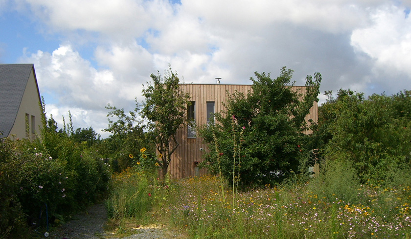
Photo © Jean-Charles Liddell
English version. La version Française de cette présentation est visible ici.
Détails du projet
« Langue de Bois »
Architect :
Atelier RVL- Jean-charles Liddell
(Pierre Alexandre Cochez, landscapist)
Year of construction : 2006
Town : Near Tours
Surface : 130m²
Materials used : Wood + concrete Floor on standard underfloor space, untreated Douglas fir for the framework, the roofing, and the boarding, placoplatre (interior walls) with reinforced insulation out of wood fiber (+ soundproofing for the bedrooms), exterior carpentry with dual glazing with reinforced insulation ; staircase and solar protection : metal sheet and expanded metal out of galvanized steel
Heating : floor heating and wood stove high output.
Duration of the study project: 6 months
Duration of the construction : 6 month
Cost: 129 000 € all taxes included
(price 2006)
« One more cube …!!! «
An appreciably atypical approach since it is about my own house : a young family wishing « to live together » in a house built with tight budget and as far as possible, most respectful of its environment.
« Architecture is an imaginary reality which voices and some time suggests unvoiced comments » – MELVIN CHARNEY
The site is an old orchard of a house built in the 1960s alongside a quiet street located in an old borough that has become residential, at the immediate outskirts of Tours city. The ground is encircled on three on its sides (east, north, south) by very close houses. The blocked outlook entails the obligation to comply with the 3 m separating limits. The east-west aspect of the long strip of ground is perpendicular to the street. On the west side sits a shed in its original shape. On the east side, running from the street, an access-path skirts the existing house and its back garden, then spreads on 60 m X 15.5m with on one side, to the north, a bulky middle-class, twentieth century house built out of micaceous chalk and on the other, to the south, a more recent masonry. The house will be erected on the last third of the ground Thus releasing, in front of the house, a vast planted surface made up of existing fruit trees, it will function like a buffer zone with the surrounding houses. On the back, a true external “room” is created, more private and hidden from the eyes of the neighbours. The dominant winds blow from the west, and very occasionally from the north, is comparatively strong on the upper floor because of the headland position of the site.
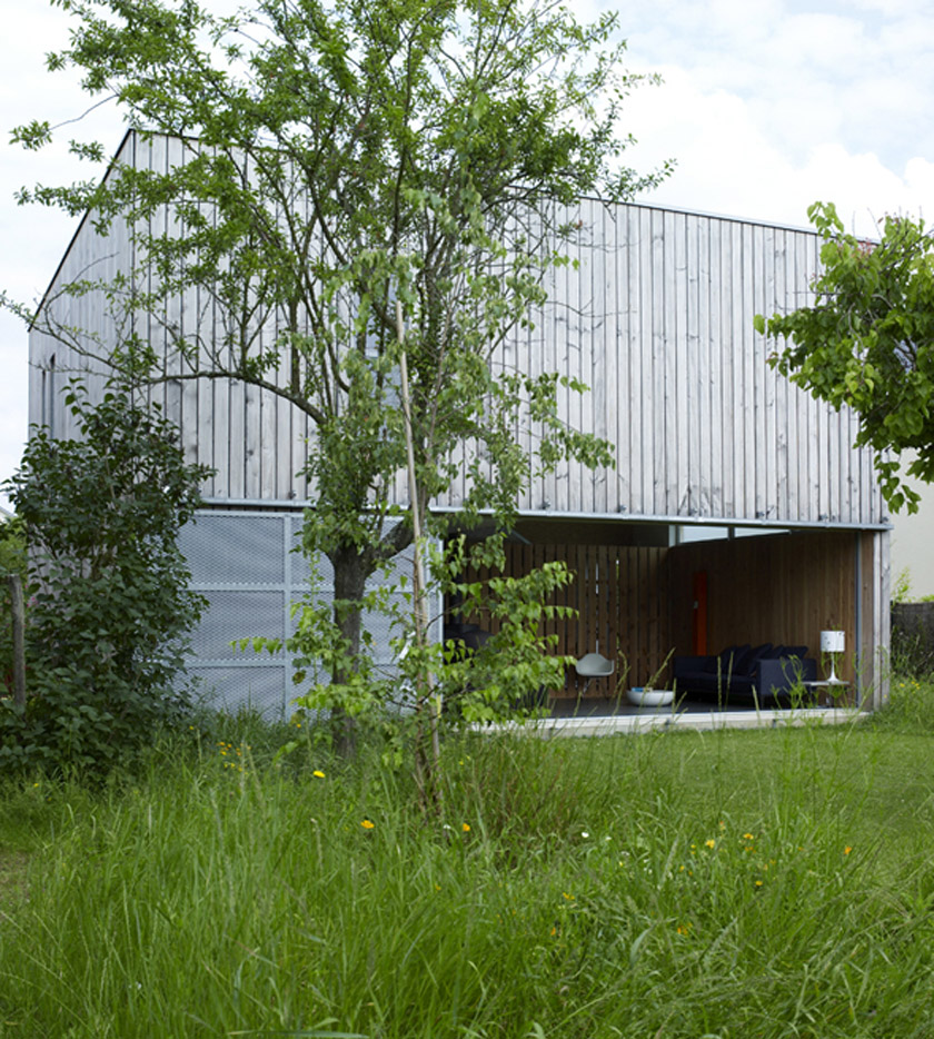 Photo © Gaëlle Leboulicot
A not structured form
“One more cube … !!! ” … This house is inspired by the site and echoes the existing shed sitting at the far end of the ground : A form “not structured” with rough materials more or less diverted. The basics in a word !! …
No formal gesticulations. One starts from “what is ordinary”, tedious, a formless , caricatural form ending up with something slightly extraordinary … starting from what is most economical in short and long-term, (dimension 9.43m X 9.43m accepting the standards ranging from the wood framework to the foundations and floor on VS and to the wood panels of the 15 cm wide boarding); Thus the whole house was delivered in a semitrailer, composed of 8 wood panels pre assembled, as a result of this: 2 days of assembly; and most ecological (optimum compactness; Because of the choice of the openings, interior layout and heating floor, the heating bill is divided by four).
With each time one hollows out the cube to create openings, one finds the interior walls echoing them, so that the light is pushed back or filtered. Each opening is made according to orientation and views … (the vertical windows of the sleeping areas overlook the garden without being overlooked, the upper south window lobs the neighbour’s house in term of sunshine … etc)
A simple constructive principle
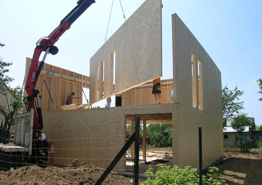 Photo © Jean-Charles Liddell
We thus have an extremely simple constructive principle, in close relationship to interior space (« occupying » the structure) :
on the ground floor and floor, the bracing of the central post is achieved by two porous walls, genuine gills of the house, separating the space, creating the effects of folding screens, kinetics effects, the playful effects between natural and artificial light : these walls filter the moments of the day, their articulation is reinforced by the staircase and the stove (one passes “below, above, in front of, behind the walls”, accompaniment of the light with the movement, a vertical circulation for example).
All speaks about movement and transgression of the limits (close connection between rough materials, the use, lights and shades, relationship to outside, sheen and “mixture” of materials …). Each material is used according to its mechanical properties.
The external elements are found inside, the limits become blurred (the panels of the boarding are used inside changing from 1cm of hollow joint to 3 and 7 cm, the galvanized metal staircase echoes the outside sliding shutters, the whole reinforced by the 6 m long brick partition bay which disappears … The interior wood blades are the downgraded blades of the external cladding (namely Douglas fir blades with sapwood).
The sliding shutters in deployed steel mesh, take part in solar protection in summer, turning the landscape into pixels and the interior space cosier (acting as protection).
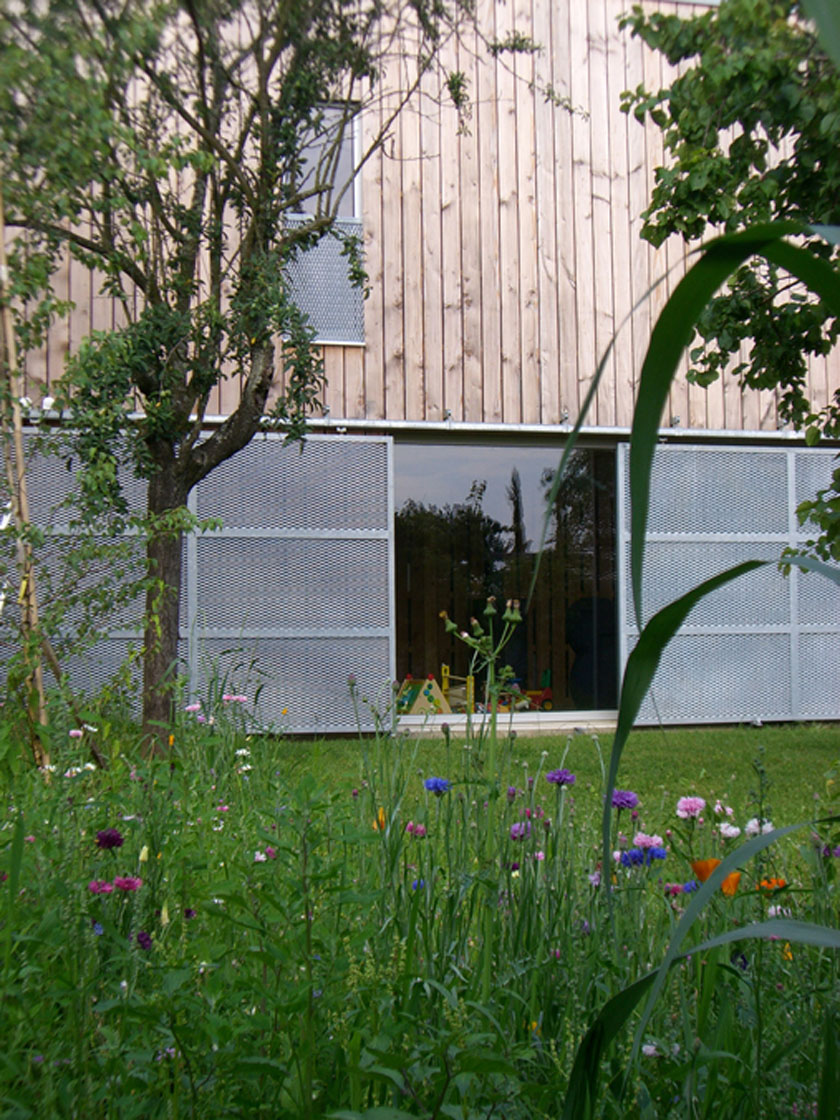 Photo © Jean-Charles Liddell
The upper large sliding shutter on the south side is activated only twice a year, « a job for the family » : to mark the change of the seasons : one closes it at the end of spring to open when autumn comes (maximum passive solar contribution ; even closed in summertime, it lets a thin band of light pervade the house). The shades of the shutters « dribble » on the semi-transparent glazing of the large south bay, making the glazing grainy by a visual effect. The materials is dematerialized : the staircase is a folded sheet metal carpet, the external boarding a true skin ; the materials merge with each other : in the long term the cladding of untreated Douglas fir will turn silvery grey, dark, bearing a sheen aspect, imitating aluminium and galvanized steel.
To summarize … on the ground floor we have a facilities area (kitchen, scullery, toilets) and on the upper floor sleeping area and bathroom. The living quarters are partitioned by the wall structure and by the different luminous surroundings : the living room is lofty, directly opening onto the « external room ». The dining room more intimate and 2.26m high, frames the view to the east, the kitchen echoes it. The hall is relatively dark, to accentuate the zenith light accompanying the staircase.
Continuity and flexibility
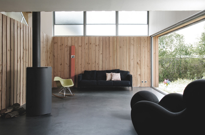 Photo © Clément Darrasse
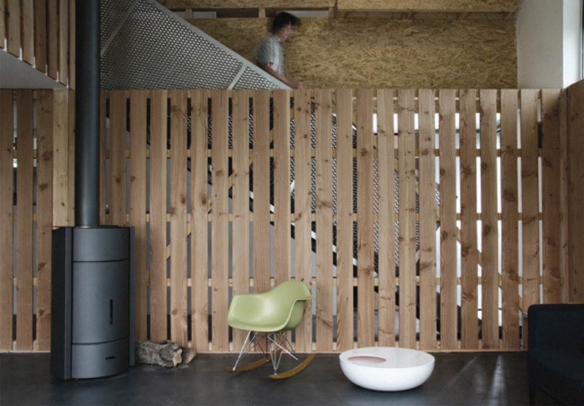 Photo © Clément Darrasse
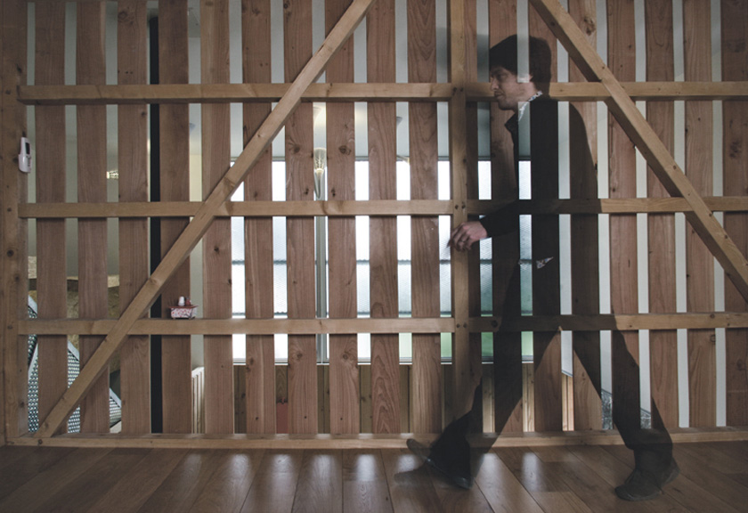 Photo © Clément Darrasse
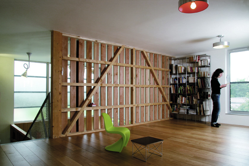 Photo © Clément Darrasse
Double height and fluidity
The house is completely open with parts off, true alcoves : areas for a rest and reading are reduced to the bare minimum : (tatami) they profit from reinforced soundproofing. The play room on the upper floor becomes the second quarter of more intimate life and voluntarily « not very definite » : storage units on wheels (usually inert) partition this part of the house according to its use (play room, storage, spare room, living room, TV room etc… with of course the possibility of making two « regular » bedrooms.
This wide range of use is a purpose relating to the « emotional », in the morning I’m looking for my own things among the toys of my little daughter (whom I do not see enough, but from whom I will every morning have an inventory of her « game sites » …) she wakes up with her toys that played without her !!! … hum …
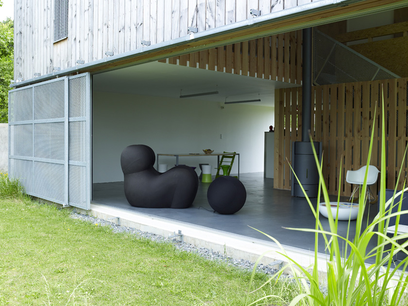 Photo © Gaëlle Leboulicot
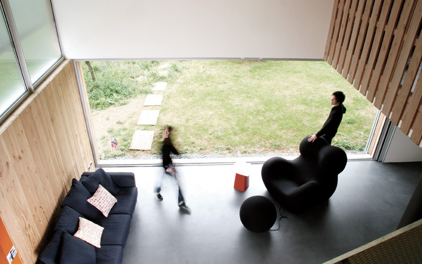 Photo © Clément Darrasse
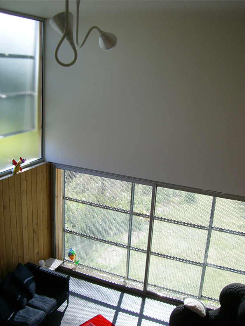 Photo © Jean-Charles Liddell
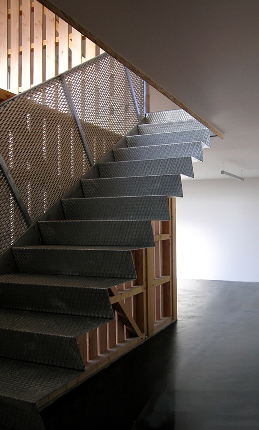 Photo © Jean-Charles Liddell
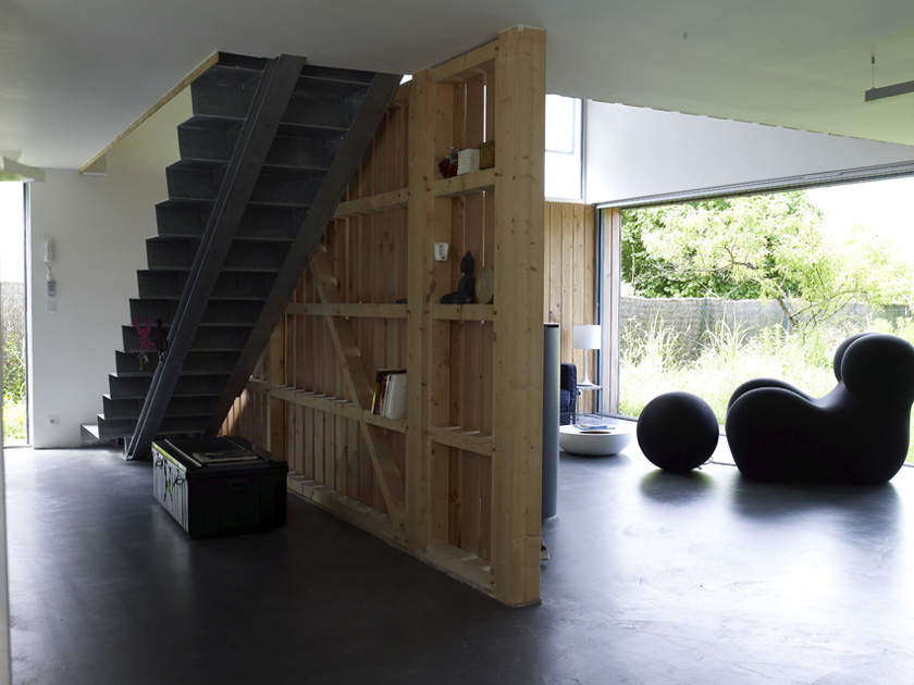 Photo © Gaëlle Leboulicot
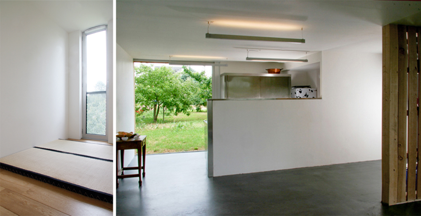 Photo © Clément Darrasse
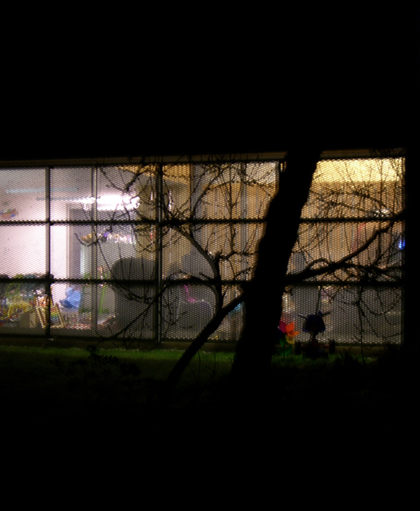 Photo © Jean-Charles Liddell
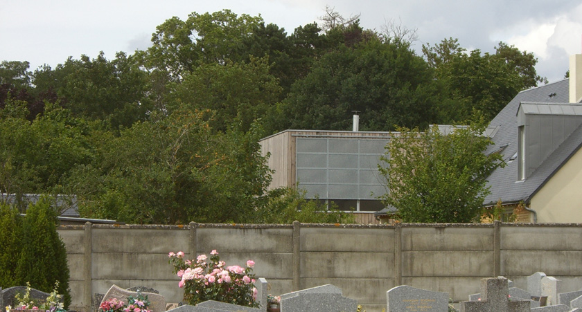 Photo © Jean-Charles Liddell
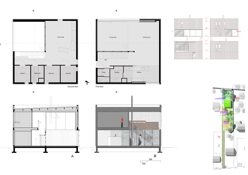
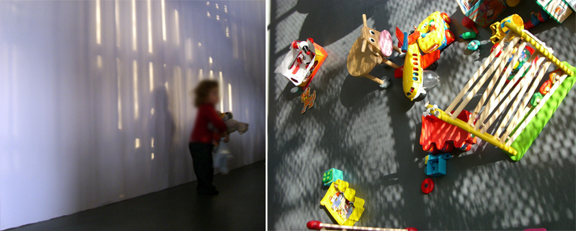 Photo © Jean-Charles Liddell
Architect of the projet …
Atelier RVL architectes, Jean-charles Liddell
Web site : www.atelierRVL.com

Ajouter un commentaire